
Boxy
a subscription-based clothing donation service designed to help users reduce textile waste 📦
Overview
Boxy is a speculative UX project that explored how design can make clothing donation more seamless and sustainable. The goal was to uncover barriers in the donation process and reimagine an experience that encourages cyclical fashion habits rather than wasteful disposal. Through research, user journey mapping, and prototyping, I designed a subscription-based donation service that simplifies packing and sending items while rewarding users for consistent participation. By lowering friction and building in motivation, Boxy demonstrates how digital tools can shift everyday behaviors toward more circular, responsible fashion cycles.
Project Type
UX Design, UX Research, Strategy
Duration
2 Weeks
Tools
Figma, Adobe Illustrator
How might we…
make recycling unwanted clothing more enticing and accessible to users, reducing overall textile waste?
Quick Stats
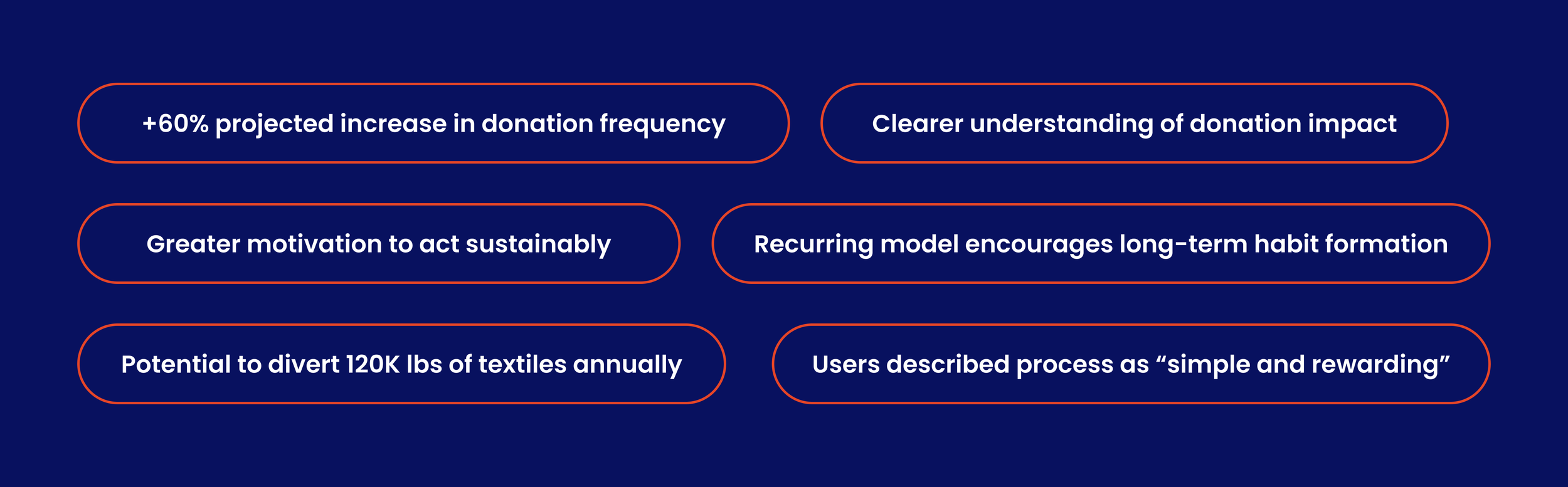
+60% Donation Frequency
User research suggests that simpler scheduling could increase donation frequency by up to 60%.+75% Motivation Boost
Emotional design and storytelling are expected to raise motivation and positive perception by 75%.120K lbs Textiles Diverted (Projected)
At scale (10K users), Boxy could keep ~120K lbs of clothing from landfills annually — saving ~95 tons of CO₂.
Role
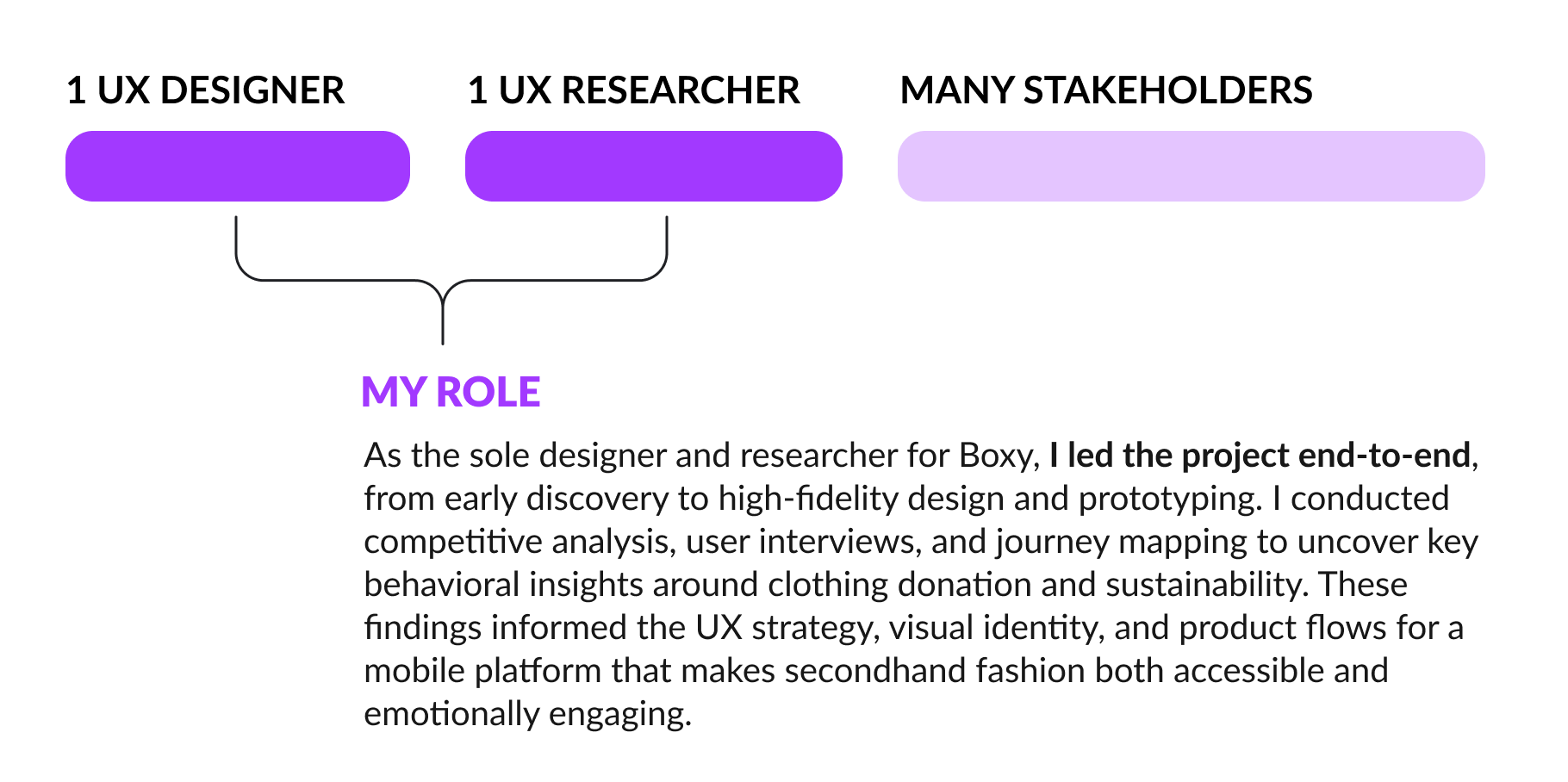
Challenge
Defining the Problem
Through my secondary research on clothing waste, I uncovered a shocking statistic: the average American discards 82 pounds of textiles annually, contributing to 11 million tons of clothing waste in the U.S. alone. Despite growing awareness of sustainability, many people still find it inconvenient or unappealing to recycle their unwanted clothing.
By addressing key barriers—such as convenience, motivation, and awareness—I aimed to design a solution that encourages users to participate in clothing recycling, ultimately diverting more textiles from landfills.
Solution
A New Way to Combat Textile Waste
Introducing Boxy - a mobile application designed to make clothing recycling more accessible and enticing. With Boxy, users can request a pre-addressed mailing box to send their unwanted clothing items directly to recycling and upcycling organizations. This eliminates barriers like transportation and uncertainty, encouraging more people to participate in sustainable fashion practices.
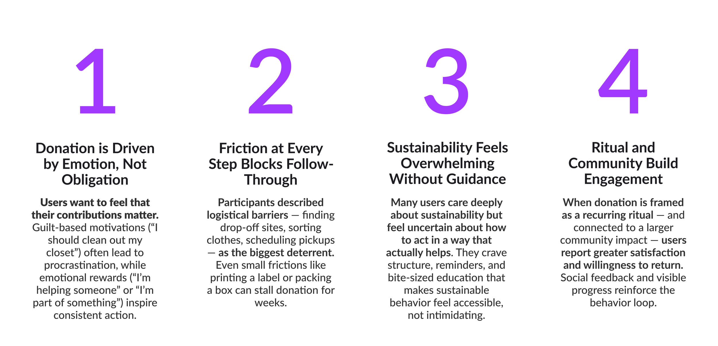
Interviews
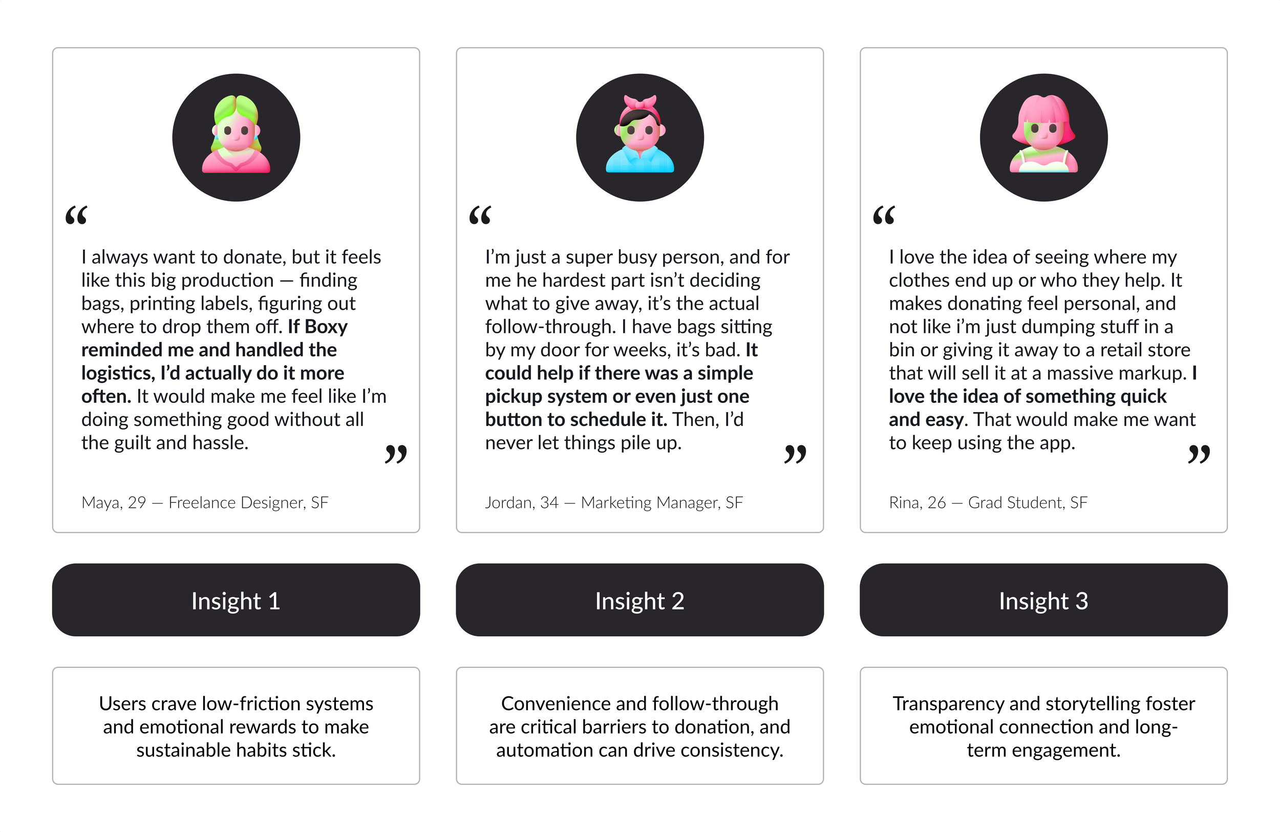
Takeaways
Key Research Findings
My literature review, user interviews, and field research led me to uncover four primary takeaways that would be used to guide the design process.
Personas
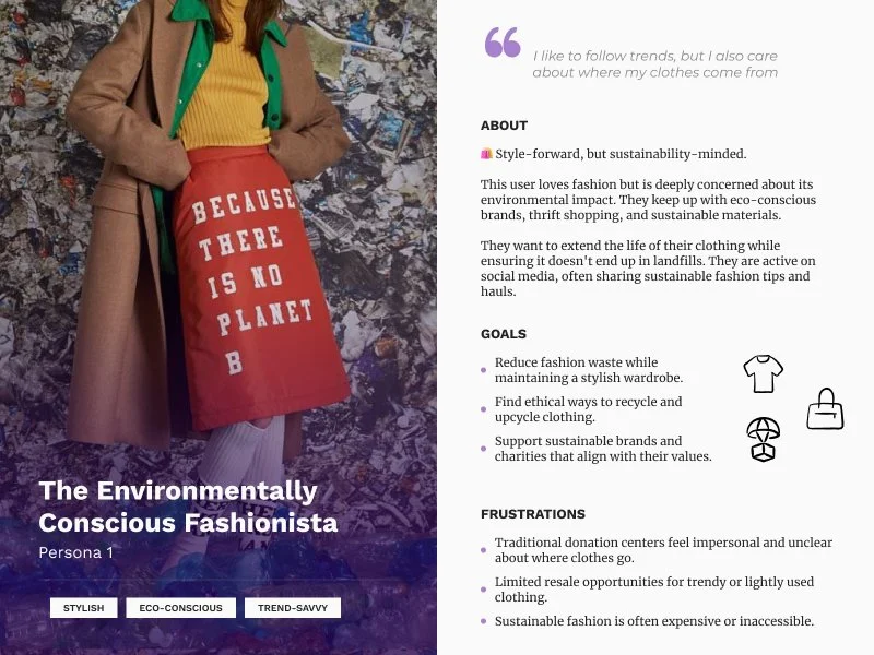

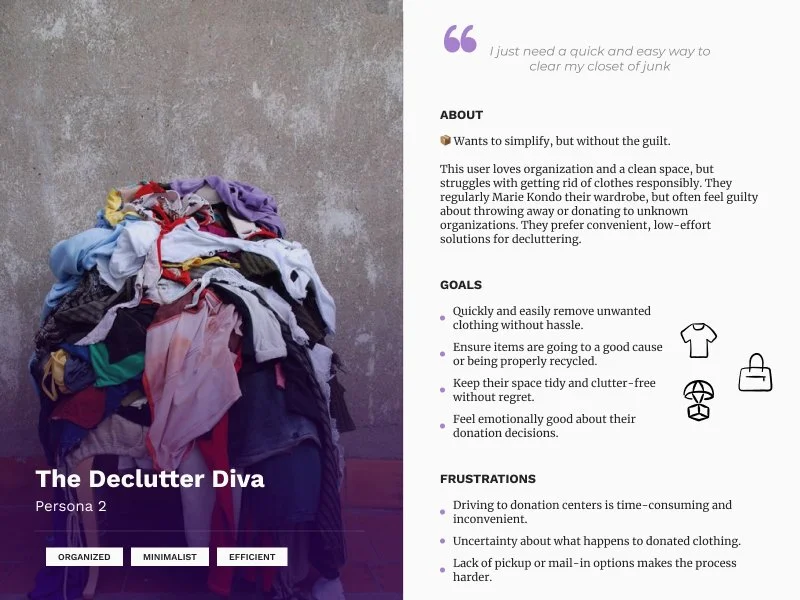
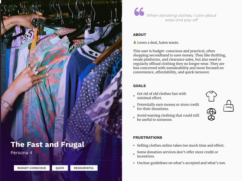
4 Key Users
After synthesizing insights from user interviews, I developed four key user groups. Each persona highlights unique motivations, barriers, and behaviors, ensuring that Boxy’s design addresses real-world frustrations and provides a seamless, engaging solution for different user types.
Storyboard


Imagining the User Experience
To bring the Boxy experience to life, I created a storyboard illustrating the end-to-end user journey, from requesting a box to successfully recycling clothing. This step helped me map the emotional journey of the user, demonstrating what the ideal outcome of usage would be.
Competitive
Analysis

Understanding the Landscape
To design an effective solution, I analyzed how existing platforms and services approach clothing donation. I conducted a competitive and comparative analysis of five companies - Depop, thredUP, Buffalo Exchange, Goodwill, and The Salvation Army - evaluating their business models, user experience, and mission alignment.
Early Sketches
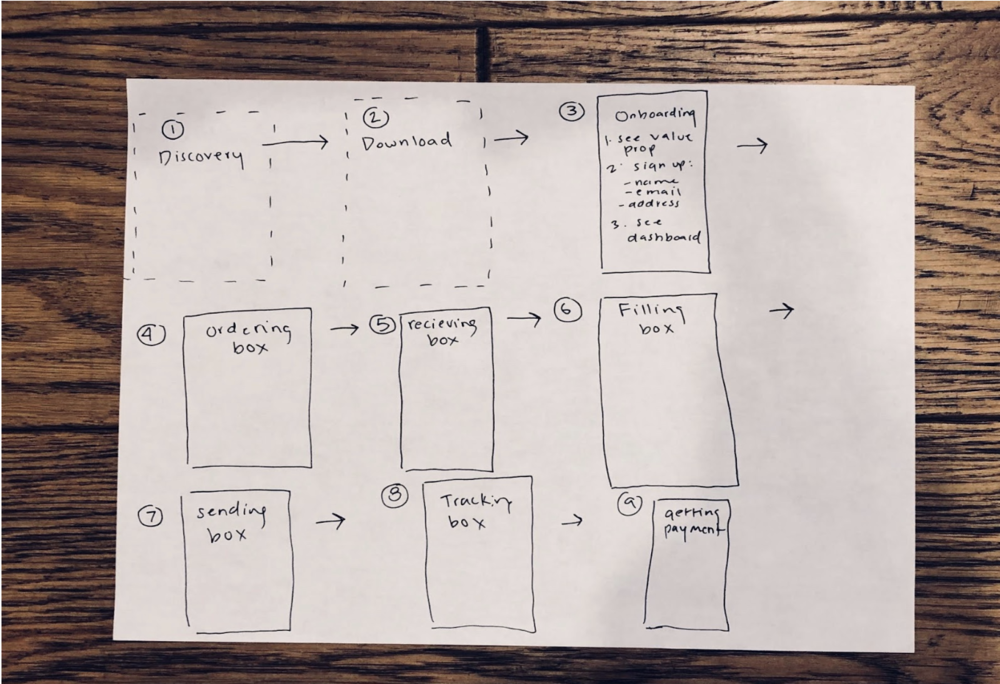

From Sketch to Strategy
I began by hand-sketching task flows, mapping out the essential user actions and decision points. This process allowed me to explore multiple pathways quickly, refining the overall logic of the experience before committing to digital design.
User Flow

Mapping the Journey
Once I solidified the structure, I transitioned the early sketches above into a digital user flow — mapping the general experience of the app.
Paper
Prototyping
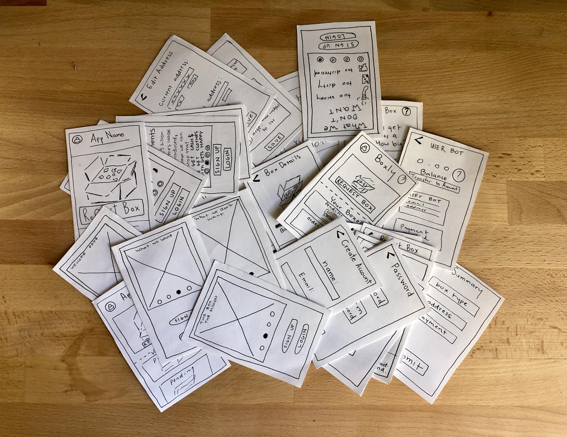
Testing for Viability
With a clear vision of how users would interact with Boxy, I created a low-fidelity paper prototype to quickly test the usability of my design. This method allowed me to gather immediate feedback before investing in high-fidelity mockups.
I asked users to complete three key tasks:
Create an account
Request a donation box
Track the status of their box
All five participants successfully completed these tasks in under three minutes, confirming that the flow was intuitive and efficient.
Wireframes

Task 1: Seamless Onboarding
I designed wireframes that introduced Boxy’s purpose while allowing users to create an account quickly.


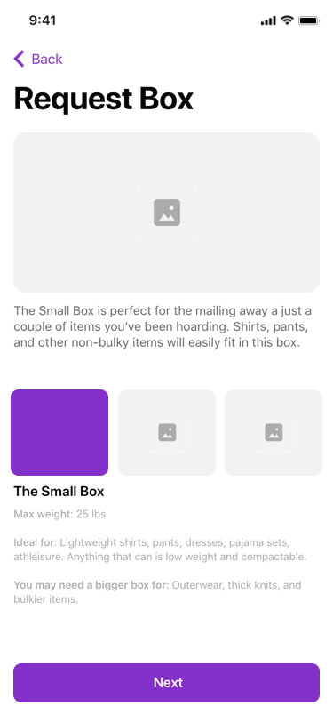
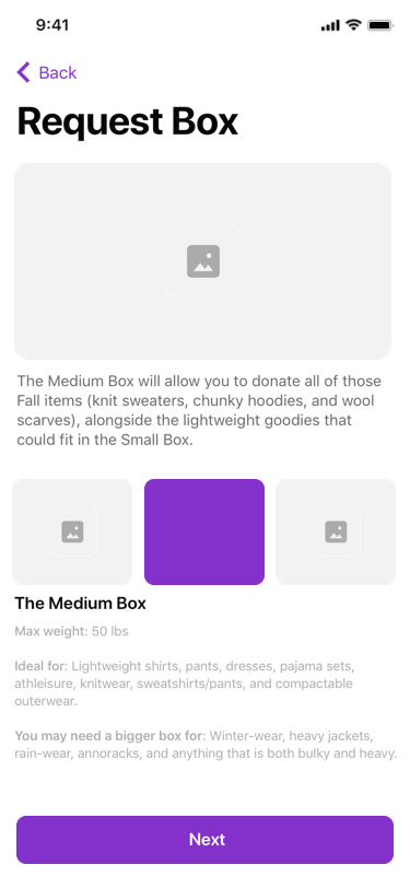
Task 2: Requesting a Box
The core function of Boxy revolves around choosing a box size, entering delivery details, selecting a charity, and confirming the order. This step needed to be straightforward while providing flexibility for user preferences.


Task 3: Managing Donations
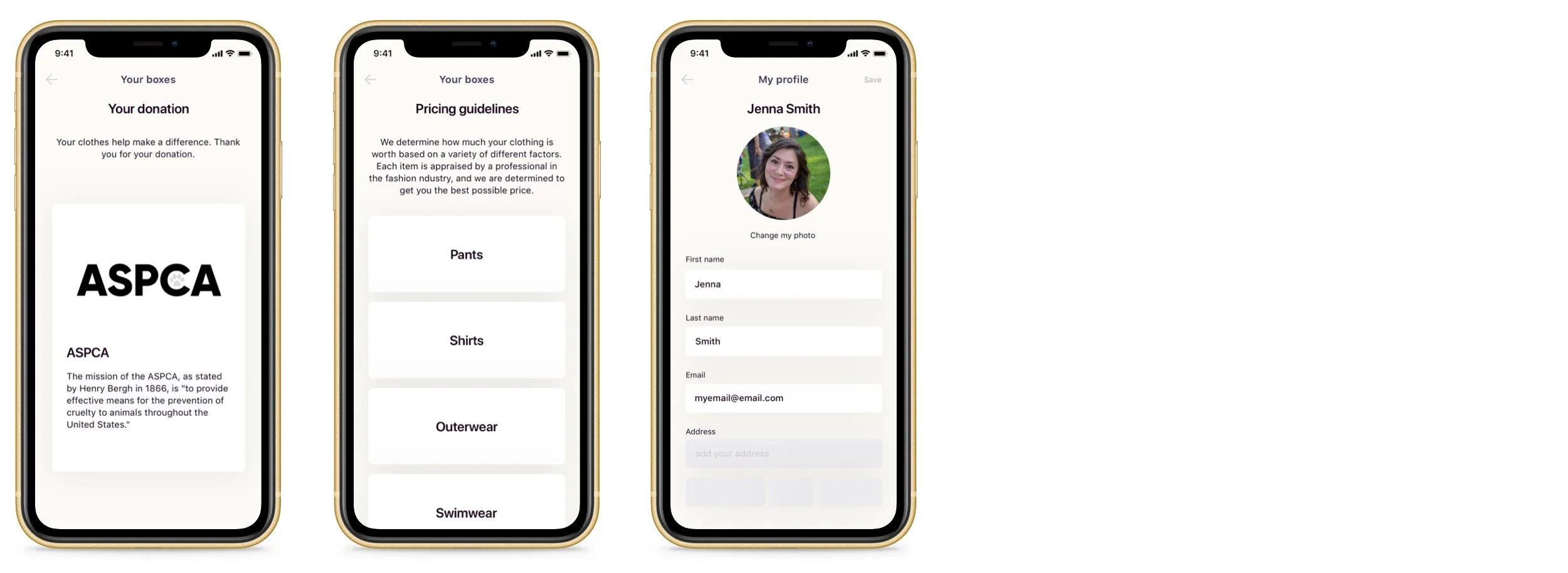
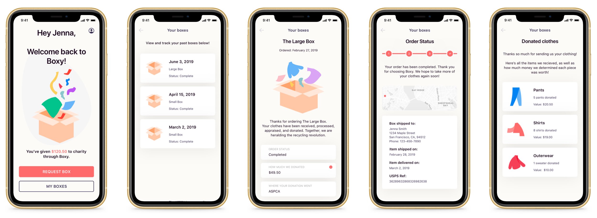
The final set of wireframes covered profile access, tracking past orders, understanding Boxy’s pricing system, and exploring partnered charities. This section reinforced transparency and trust, allowing users to stay connected with their contributions.
Usability
Testing

Identifying & Fixing Flaws
To validate the wireframes, I conducted six moderated, usability tests using an interactive prototype. I measured effectiveness with a SUS usability scale, yielding an impressive 98.8% approval rate.
Despite the strong results, I identified pain points on the donation screen, where users hesitated or required extra steps to complete a task. These insights informed key UI refinements in the final design.
Animation Experiments
Enhancing Engagement Through Motion
To bring Boxy’s interactions to life, I experimented with interaction design, focusing on micro-interactions for selecting a box. These animations added subtle movement, reinforcing a delightful and intuitive user experience.
Final UI
Funky, Colorful, and Earth-Friendly
With countless iterations, a vibrant color palette, and a focus on both function and delight, the final UI for Boxy came together. Every design choice prioritizes usability, accessibility, and engagement, ensuring users feel excited and empowered to recycle their unwanted clothing.

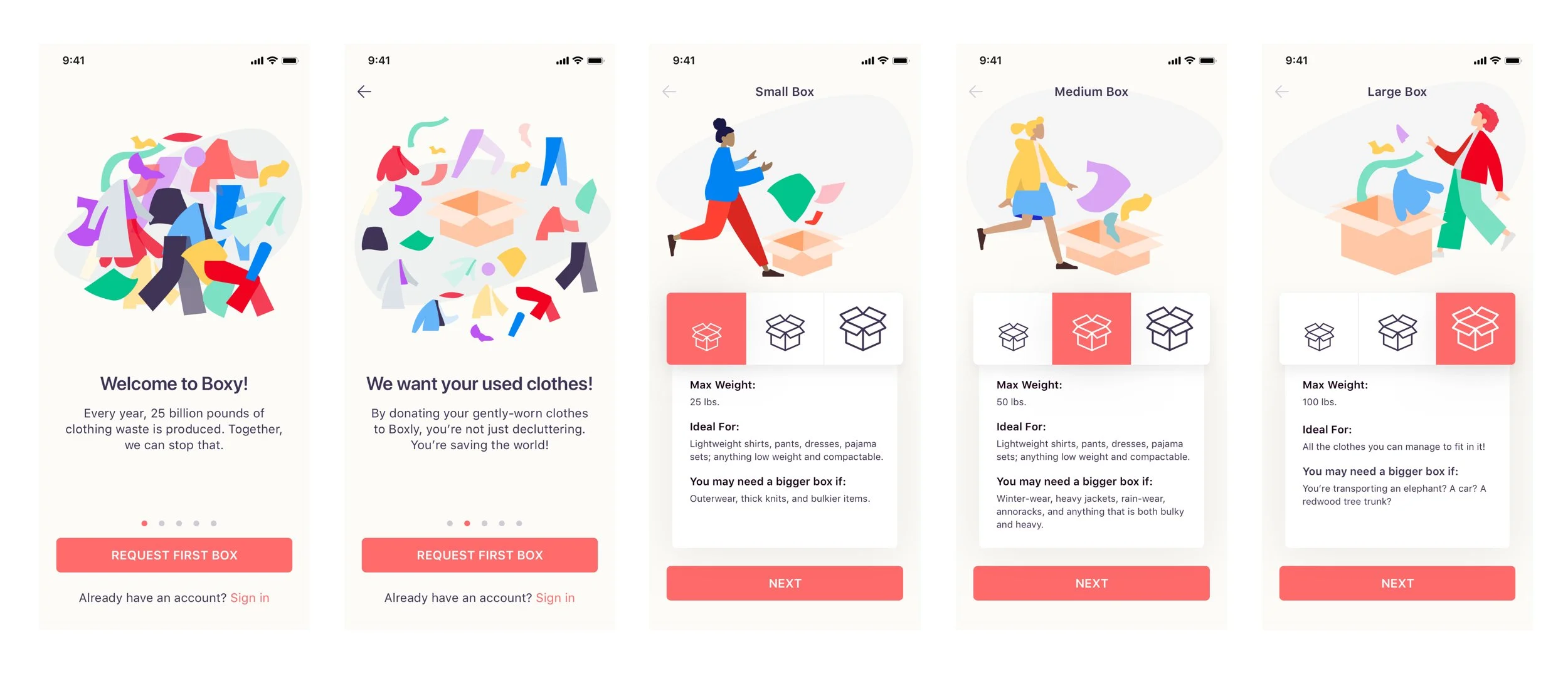
Task 1: Onboarding
To introduce users to the app, I created some screens to describe how the Boxy donation process works.
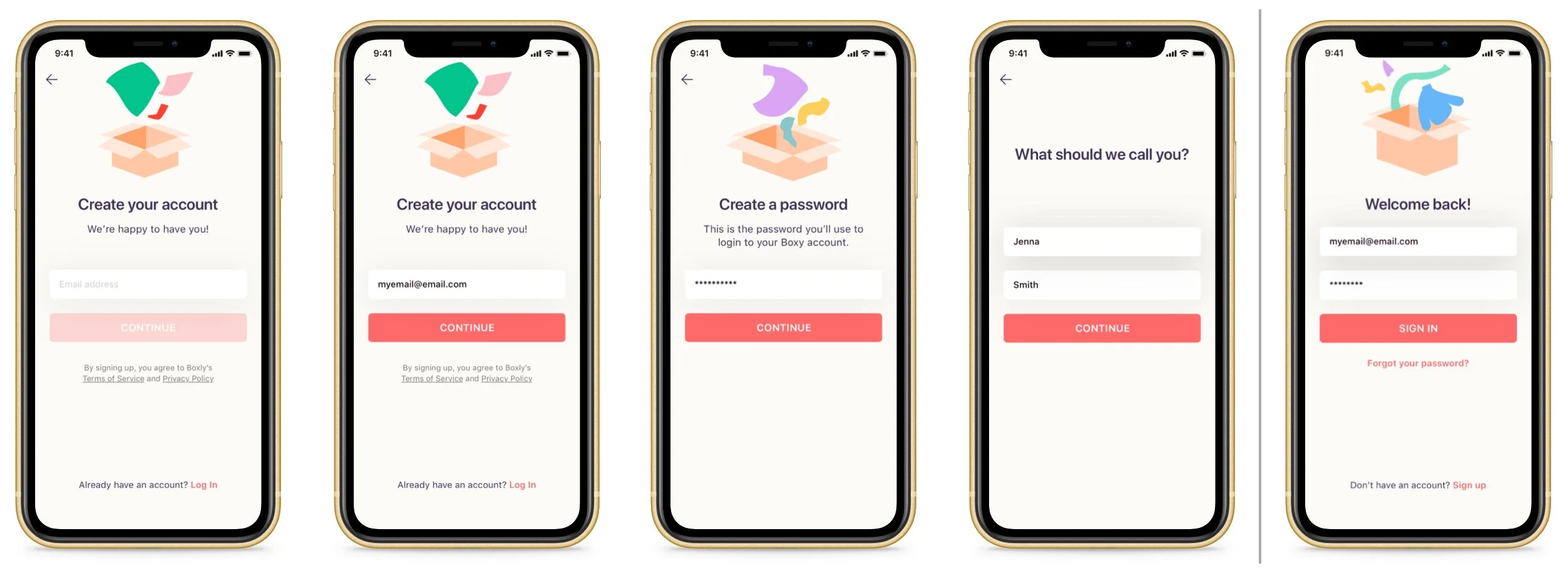
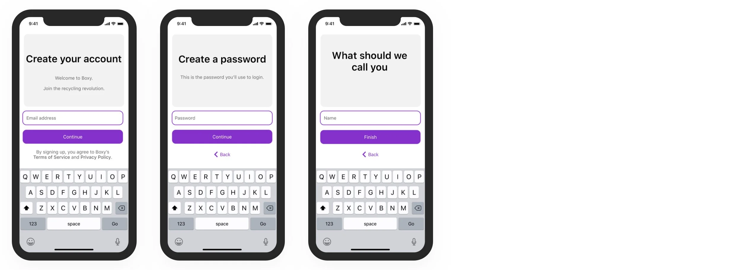
Task 2: Signup
To reduce friction and improve user adoption, I designed a streamlined signup flow requiring only three essential fields: email, password, and name. By minimizing steps, users could quickly create an account and begin engaging with Boxy’s services without unnecessary barriers.
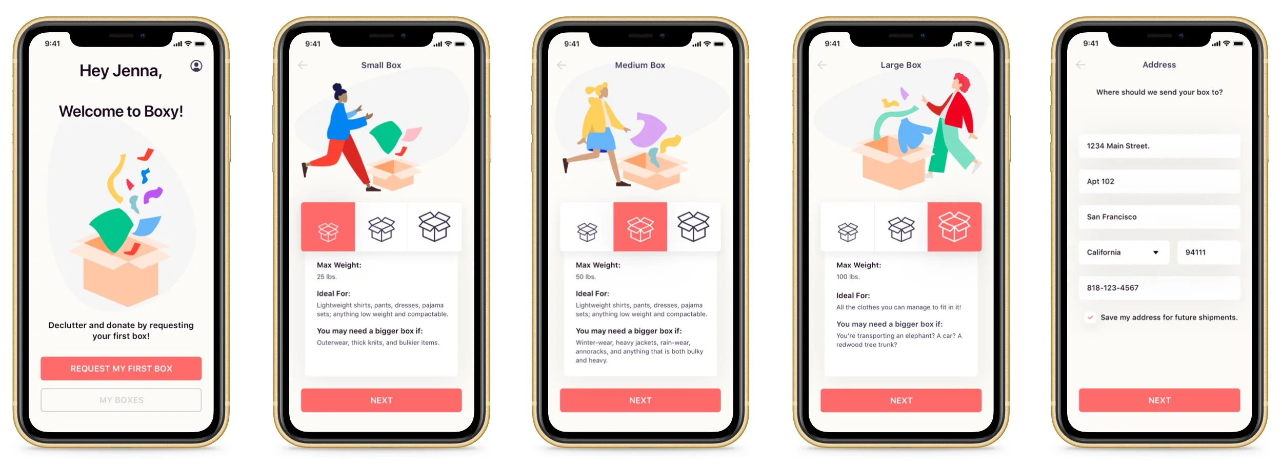
Task 3: Selecting a Box
Upon signing in, users land on a clear, structured dashboard that allows them to request a box, track past orders, or access their profile. Selecting a box triggers a state change, providing immediate visual confirmation before guiding users to the next step.

Task 4: Selecting a Charity
To make the donation process intuitive and engaging, I designed a card-based selection system featuring black-and-white logo renders and brief descriptions of each organization. Users can flip through options to find a charity that aligns with their values, ensuring a sense of personal connection and impact.
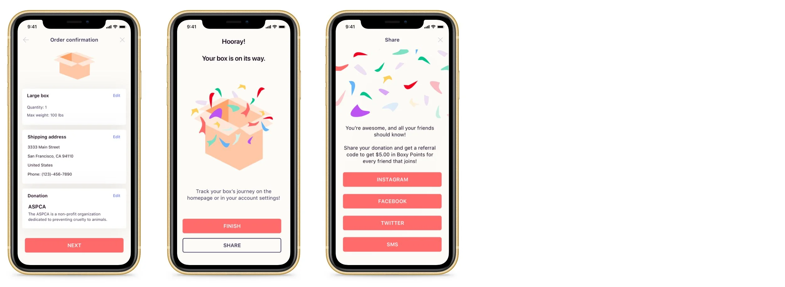
Task 5: Checkout
Once a user selects a box size, enters shipping details, and chooses a charity, they are taken to a confirmation screen. Here, they can either finalize their order or exit. After checkout, users are encouraged to return to the home screen or share their donation on social media, reinforcing engagement and advocacy.
Task 6: Ongoing Use
Beyond one-time use, I implemented features to encourage repeat engagement, allowing users to track past orders, review donation history, learn about pricing and appraisals, and manage their profile. By making impact visible and accessible, Boxy fosters continued participation and sustainable habits.
Design
System
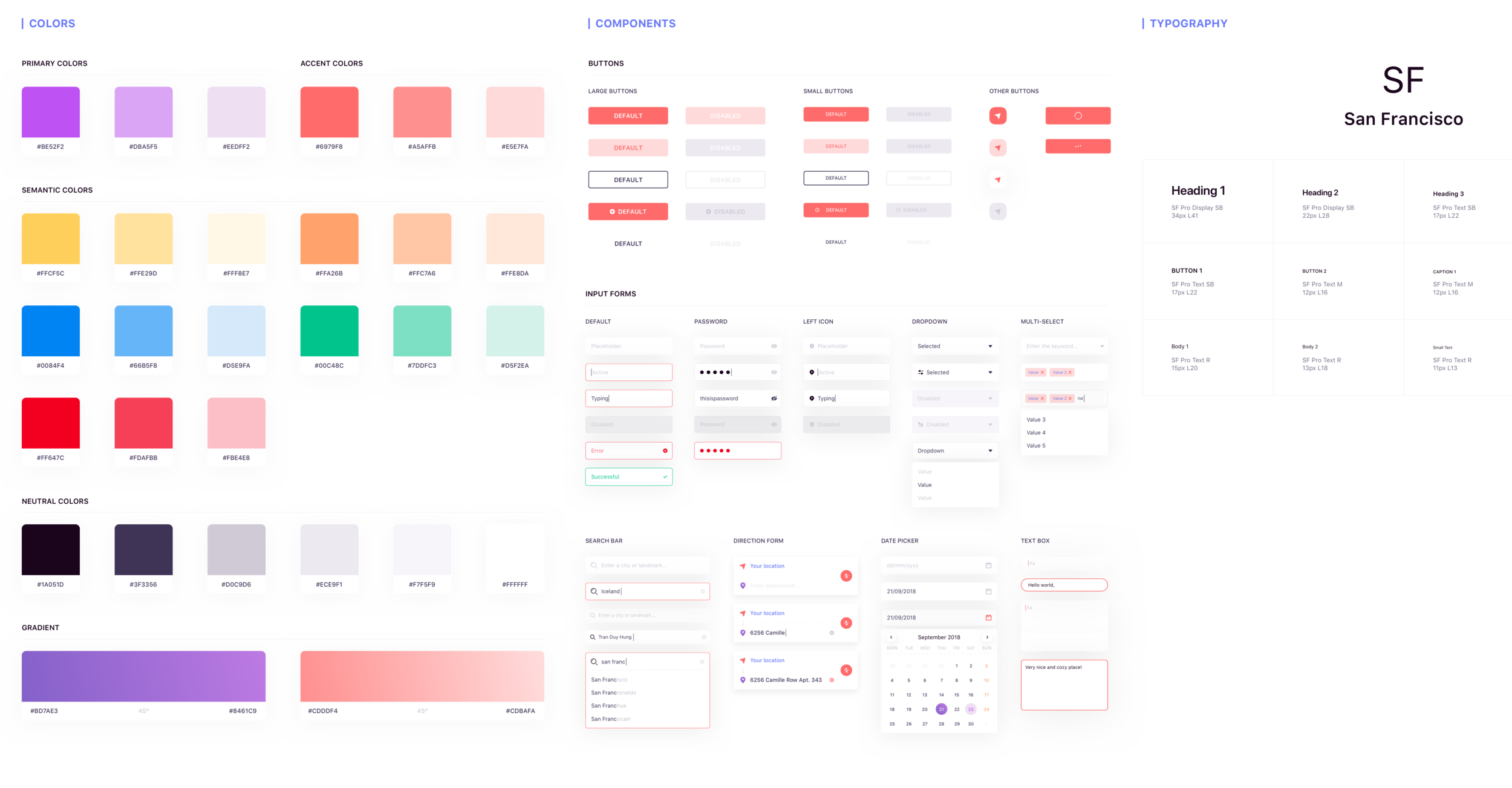
Creating Consistency
Throughout this project, I defined and developed a design language that could be used to scale the platform quickly and efficiently .
Outcomes 🎉
Reflection
Designing for Scalability, Impact, and Usability
Working on Boxy reinforced some key principles that shape my approach as a UX designer, especially when designing for scalability, engagement, and long-term user adoption.
Looking beyond competitors can lead to more solutions:
I realized that focusing solely on direct competitors wasn’t always the most effective way to gather insights. Instead, analyzing apps and services with similar user flows but different industries helped me identify fresh opportunities and push beyond conventional solutions.Systems thinking makes for scalable UI design:
Throughout this project, I prioritized design patterns and consistency, ensuring the experience felt intuitive across different screens. Taking a systematic approach made the UI more scalable and adaptable, reinforcing the importance of designing for long-term growth rather than just short-term usability.Prototyping early and often leads to stronger, user-validated designs:
I leaned heavily on rapid prototyping and iterative validation to refine Boxy’s experience, making sure every decision was backed by real user feedback. This process strengthened my ability to fail fast, learn quickly, and make strategic design decisions.